The goal of this project was to analyse and improve a mobile and desktop e-commerce purchasing journey, with a focus on readability, visual hierarchy and reducing UX friction.
The existing flow presented several usability challenges: an unclear checkout process, weak visual hierarchy, insufficient user feedback and increased cognitive load during key stages of the journey.
The redesign aimed to create a smoother, more reassuring and conversion-focused experience while maintaining a clean and consistent interface throughout the entire flow.
Confusing hierarchy
Important elements compete for attention, making the journey difficult to scan and understand.
Users cannot immediately identify where to focus or which action to prioritise.
Increased cognitive load and hesitation.
Cross-platform consistency
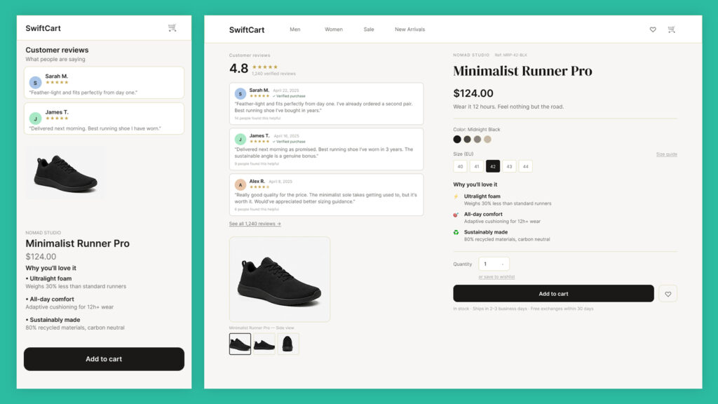
The experience lacks consistency between desktop and mobile.
Users must adapt to different navigation patterns and interactions depending on the device.
Reduced user confidence.
Unclear progression
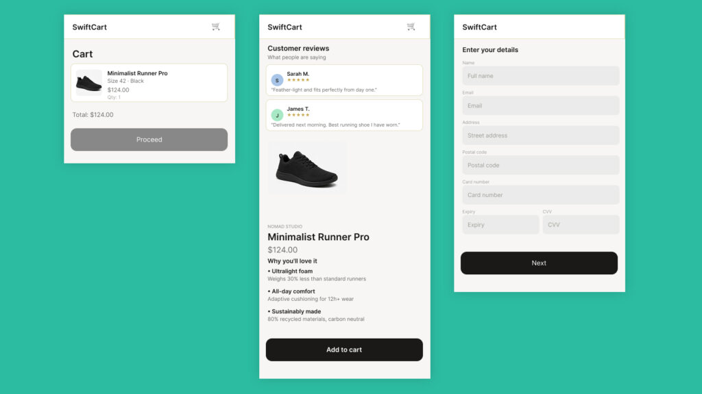
The checkout provides little indication of progress.
This can reduce their sense of control and create uncertainty before moving forward.
Perceived effort and drop-off.
Restrictive navigation
Opportunities to go back or explore alternative paths remain limited on certain screens.
Some transitions create the impression of a rigid or constrained journey.
Frustration and loss of control.
UX Review
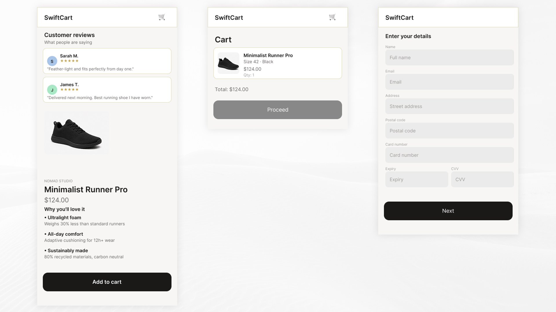
The original flow lacked clarity throughout several key stages of the purchasing journey.
Visual hierarchy issues, competing actions and the absence of clear progress indicators increased cognitive load and slowed decision-making.
The redesign focuses on creating a clearer, more reassuring and more fluid experience without adding unnecessary complexity.
UX Decisions
01
A guided checkout
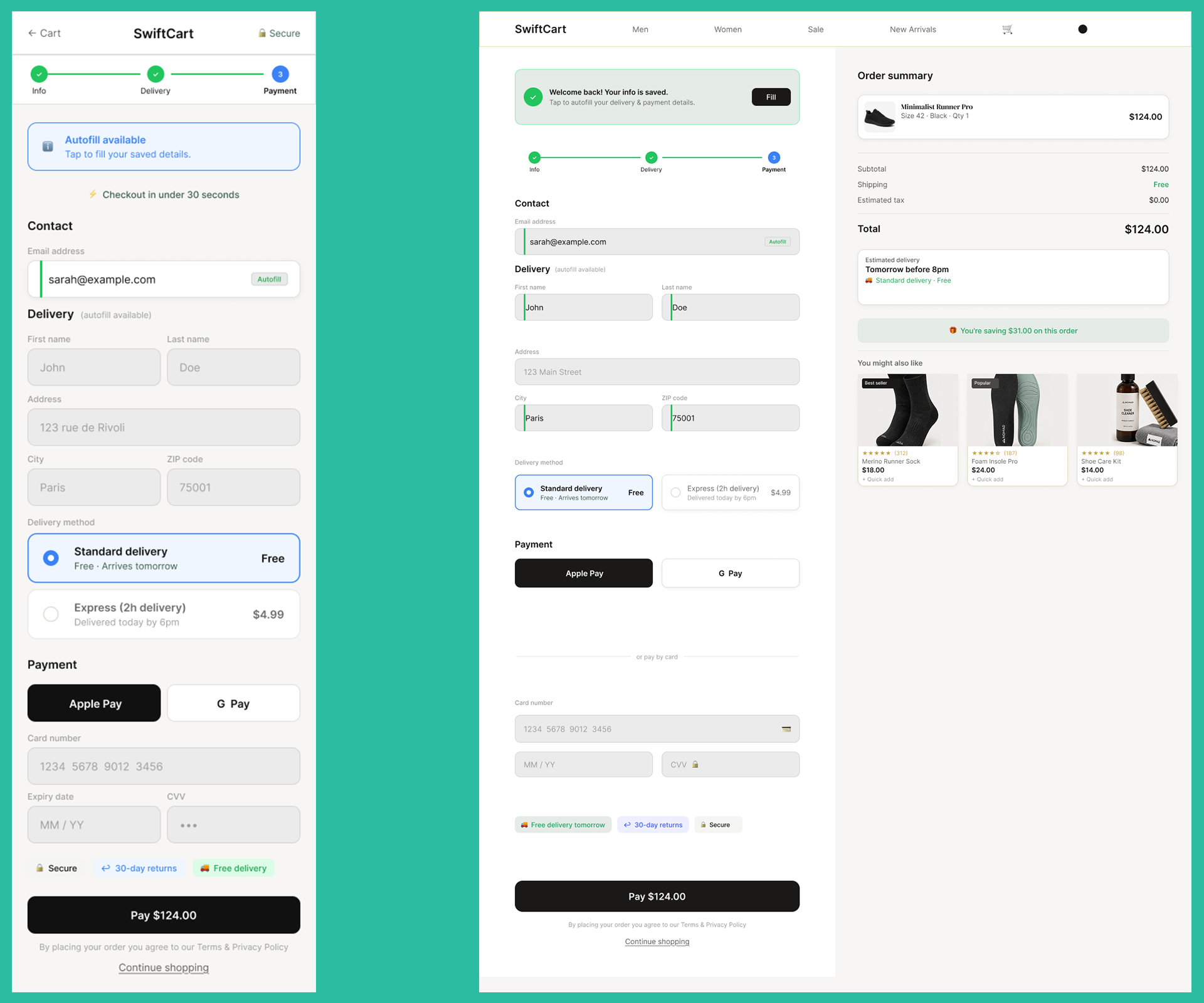
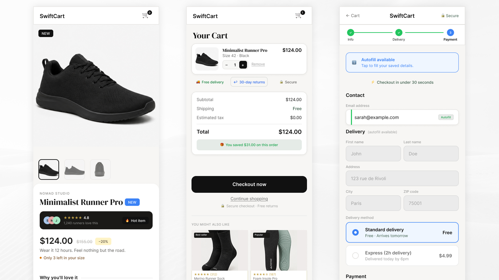
A clear stepper (Information → Delivery → Payment) was introduced, alongside a more structured form layout to make progression easier to follow.
Users always know where they are in the process.
02
A clearer hierarchy
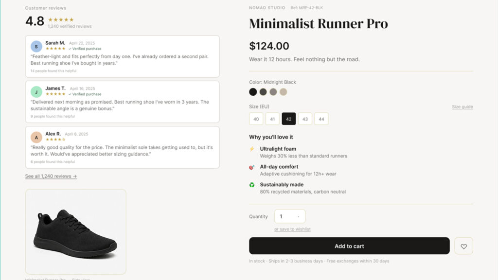
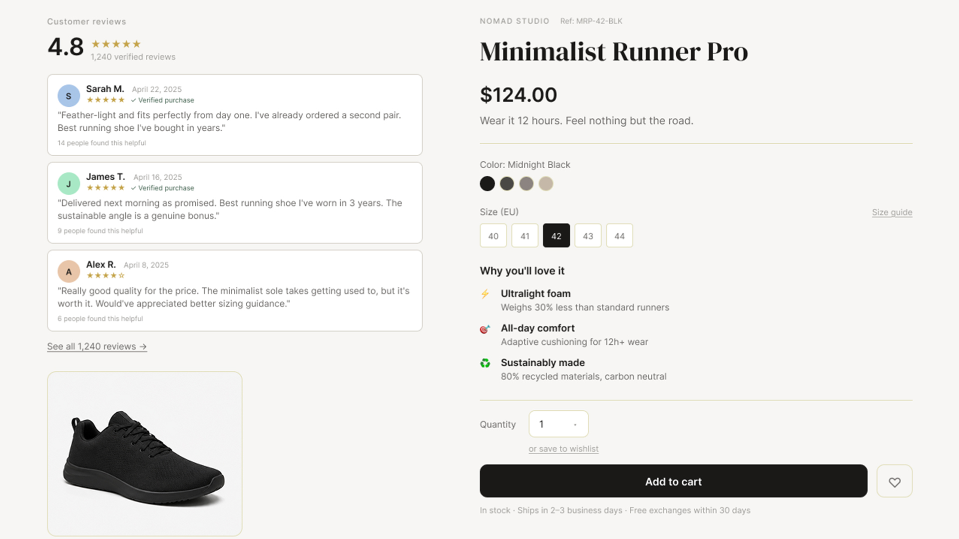
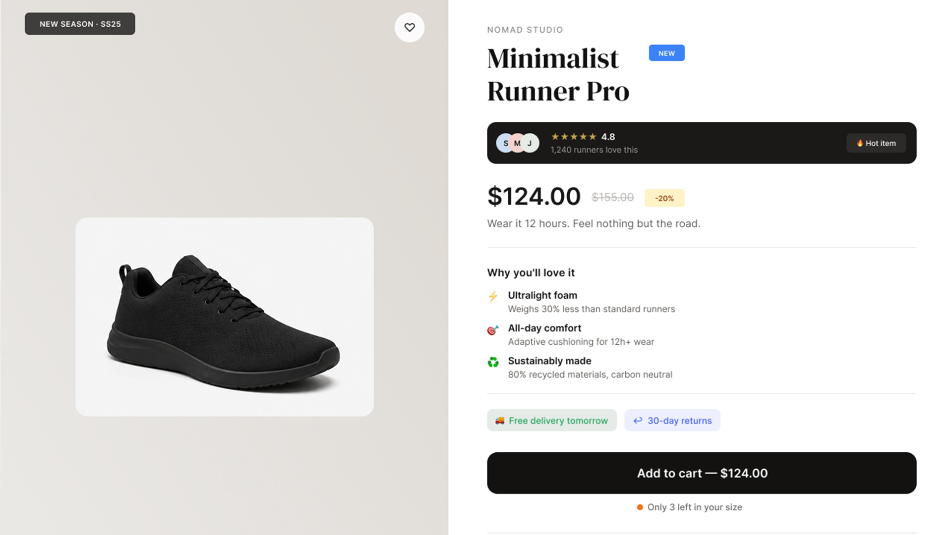
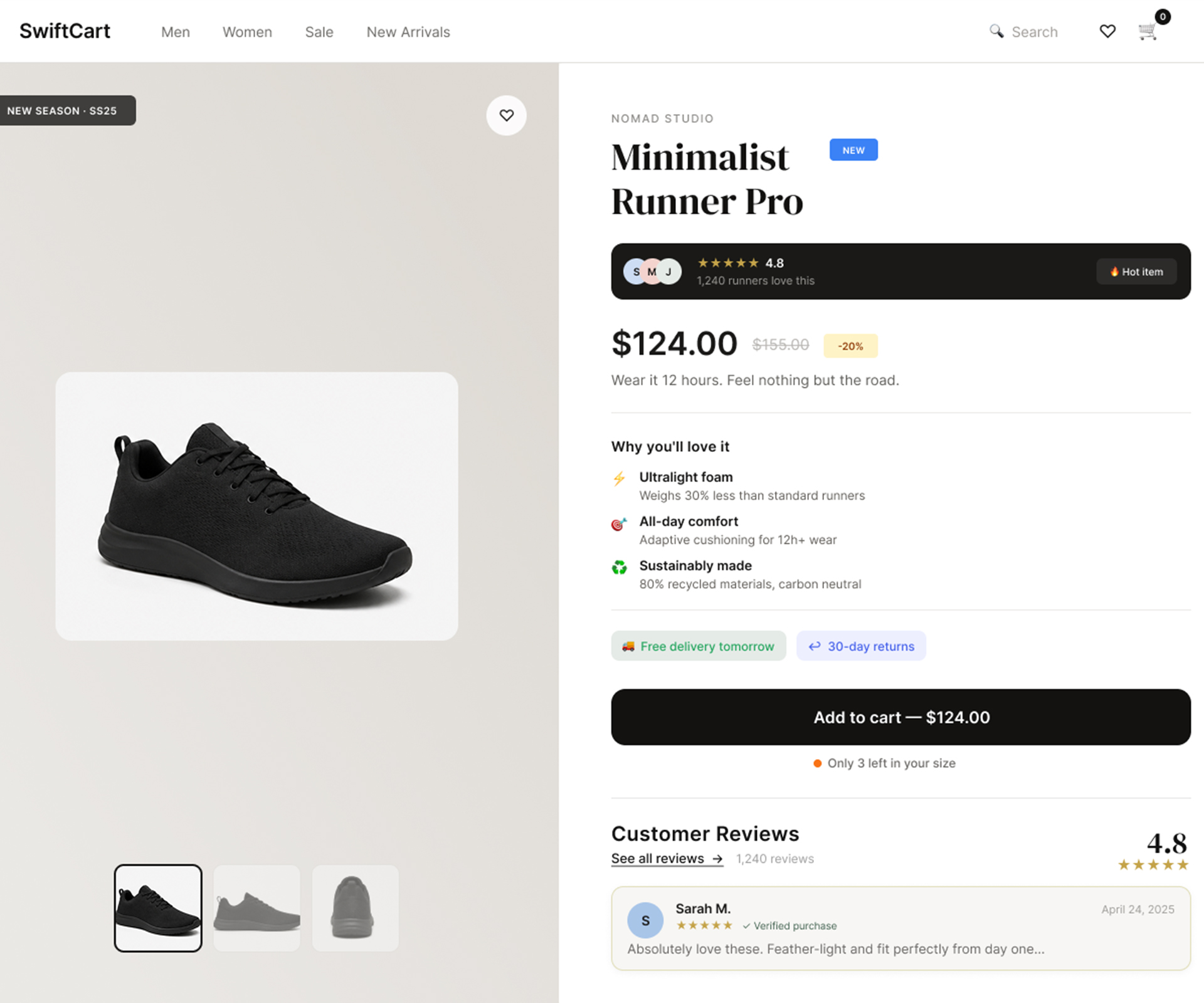
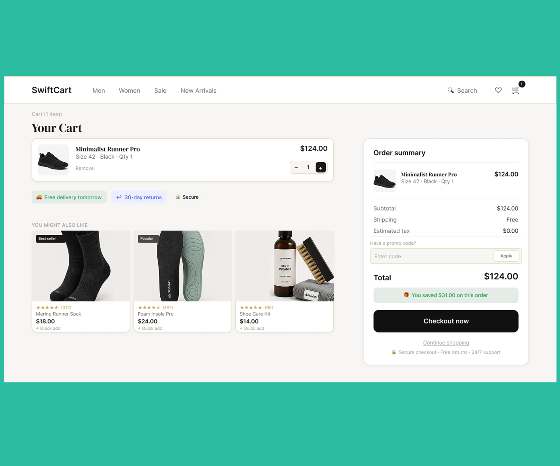
The product, price and primary CTA were given greater prominence through a stronger visual hierarchy and less dominant secondary actions.
Important elements become immediately identifiable.
03
Visible trust signals
Visual feedback, customer reviews, reassurance badges and delivery information were integrated directly into the purchasing flow.
The experience feels more trustworthy and credible.
Interface evolution
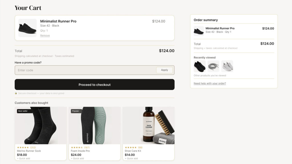
The redesigned purchasing journey delivers a smoother, clearer and better-structured experience, supported by a stronger visual hierarchy at every stage of the flow.
Products, primary actions and essential information are now easier to identify, helping reduce hesitation and simplify decision-making.
The introduction of visual feedback, progress indicators and trust signals improves overall understanding of the journey while reinforcing users’ sense of control.
CTA immédiat
Action principale visible dès l’arrivée
Checkout guidé
Progression claire à chaque étape
Feedback instantané
Confirmation visible après l’action
Panier rassurant
Décision simplifiée avant paiement
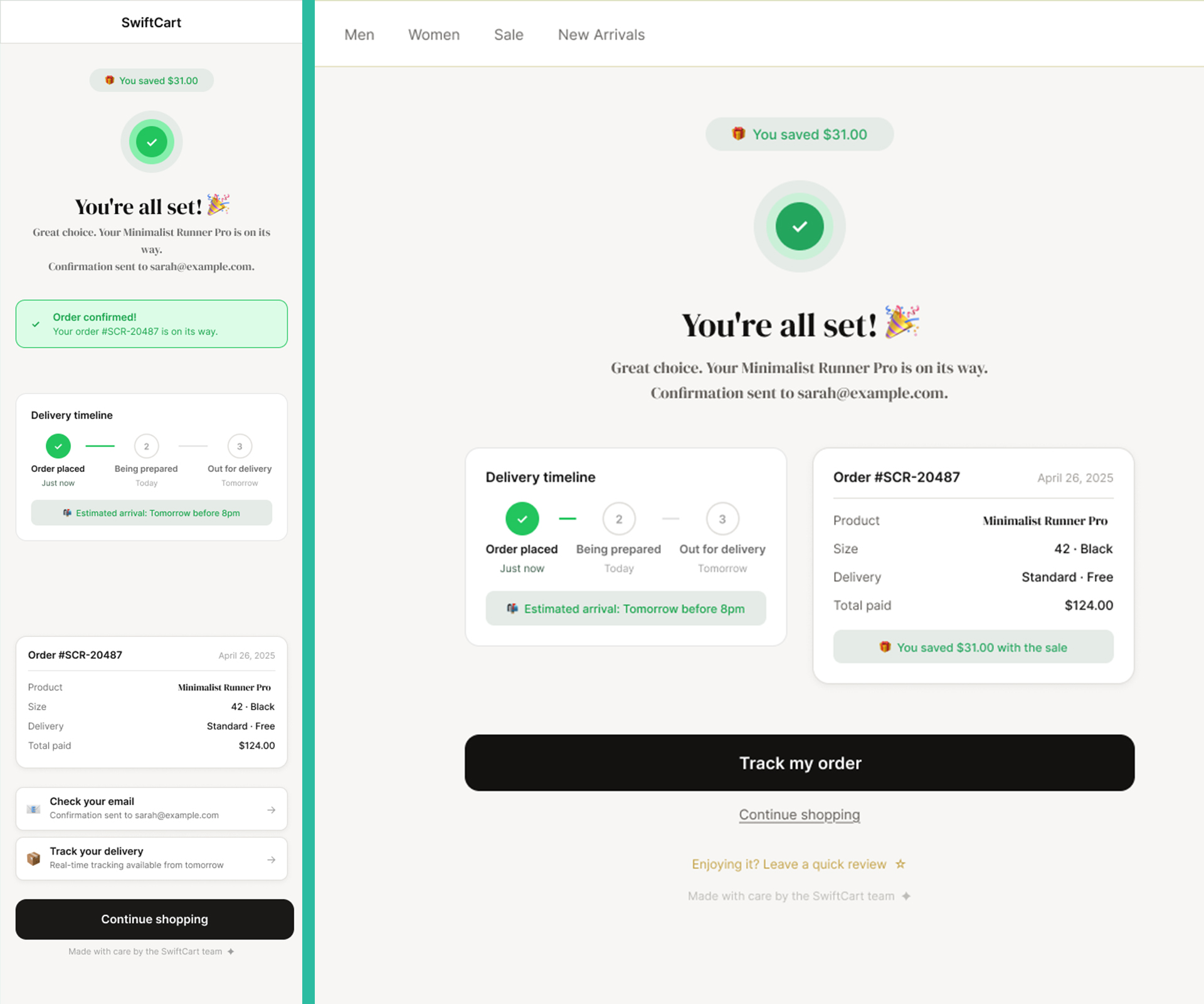
A clear and reassuring confirmation experience.
Test the prototype
From product selection to order confirmation, every step of the journey was redesigned to reduce friction and support decision-making.
The prototype showcases a smoother purchasing experience, with a stronger visual hierarchy, immediate feedback and a guided step-by-step checkout.
Explore a redesigned purchasing journey built to simplify interactions and make conversion feel more intuitive.
The prototype focuses on flow clarity, trust signals and a more seamless user progression.
Mobile
Desktop
Estimated impact
A user-centred redesign focused on improving key aspects of the purchasing experience.
potential conversion uplift
+0%
checkout hesitation
-0%
user engagement
+0%
CTA interactions
+0%
Estimates based on e-commerce UX benchmarks and user journey optimisation principles.
Users understand the journey faster, take action more easily and move through the flow with greater confidence.
Have a similar project?
I can help identify friction points and improve the clarity of your user experience.
Un site propre, même en coulisses.
J’utilise des cookies essentiels pour faire fonctionner le site, et d’autres, optionnels, pour comprendre ce qui fonctionne — ou pas.
Rien de caché. Rien d’imposé. Vous gardez la main.
En savoir plus
Les cookies me permettent de faire fonctionner le site et d’améliorer votre expérience. Certains sont indispensables. D’autres m'aident à comprendre comment vous utilisez le site, pour l’améliorer en continu. Vous pouvez choisir ce que vous acceptez à tout moment.
Les cookies nécessaires contribuent à rendre un site Web utilisable en activant des fonctions de base telles que la navigation dans les pages et l\'accès aux zones sécurisées du site Web. Le site Web ne peut pas fonctionner correctement sans ces cookies.
Les cookies marketing sont utilisés pour suivre les visiteurs sur les sites Web. L\'intention est de afficher des publicités pertinentes et engageantes pour l\'utilisateur individuel et ainsi plus précieuses pour les éditeurs et les annonceurs tiers.
Les cookies analytiques aident les propriétaires de sites Web à comprendre comment les visiteurs interagissent avec les sites Web en collectant et en rapportant des informations de manière anonyme.
Les cookies de préférence permettent à un site web de mémoriser des informations qui modifient le comportement ou l\'apparence du site, comme votre langue préférée ou la région dans laquelle vous vous trouvez.