The goal of this project was to analyse and improve the appointment booking journey for a multidisciplinary healthcare practice.
The existing flow contained several friction points affecting both understanding and progression, particularly during practitioner selection and appointment confirmation.
The redesign focused on creating a clearer, smoother and more reassuring experience through improvements to both the user journey and the visual interface.
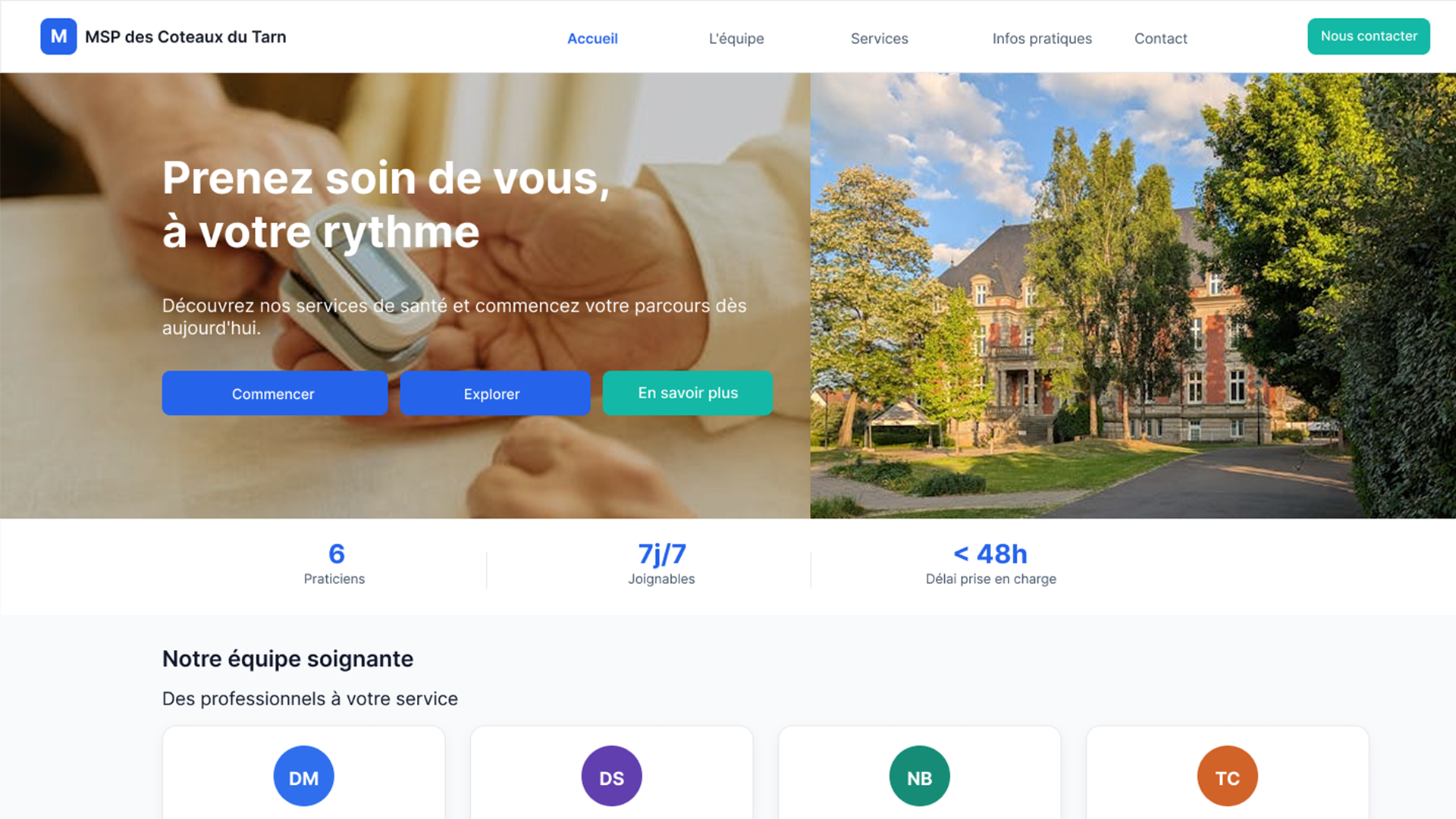
Inefficient booking journey
Users have no clear way to book an appointment.
The process relies on a generic contact form or a phone call.
Frustration and user drop-off.
Too many actions, no clear direction
Several actions compete for attention without a clear hierarchy.
Users are unsure what to do next.
User hesitation and uncertainty.
No visibility into availability
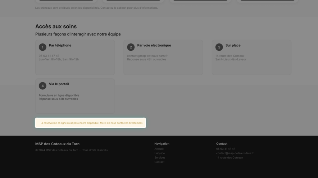
Appointment slots are not accessible online, making it difficult to plan ahead.
Unnecessary effort for users.
Interrupted journey
Booking an appointment requires leaving the digital experience to make a phone call.
Lost time and confusion.
UX Review
Users encounter difficulties from the very first interactions due to unclear journey steps and a lack of visual hierarchy.
The flow provides limited guidance, creating hesitation and uncertainty throughout the experience.
These issues directly affect understanding, usability and trust.
UX Decisions
01
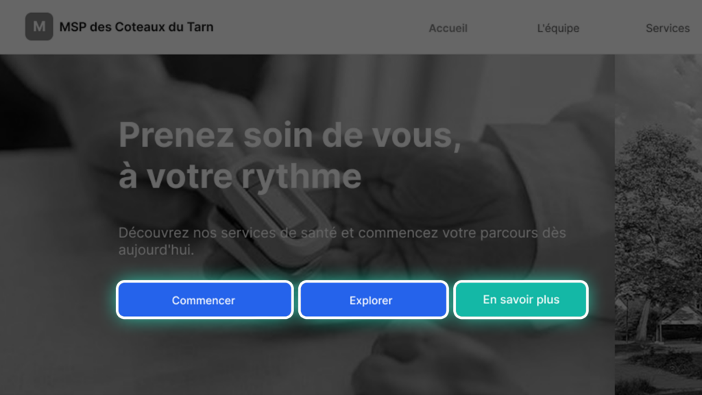
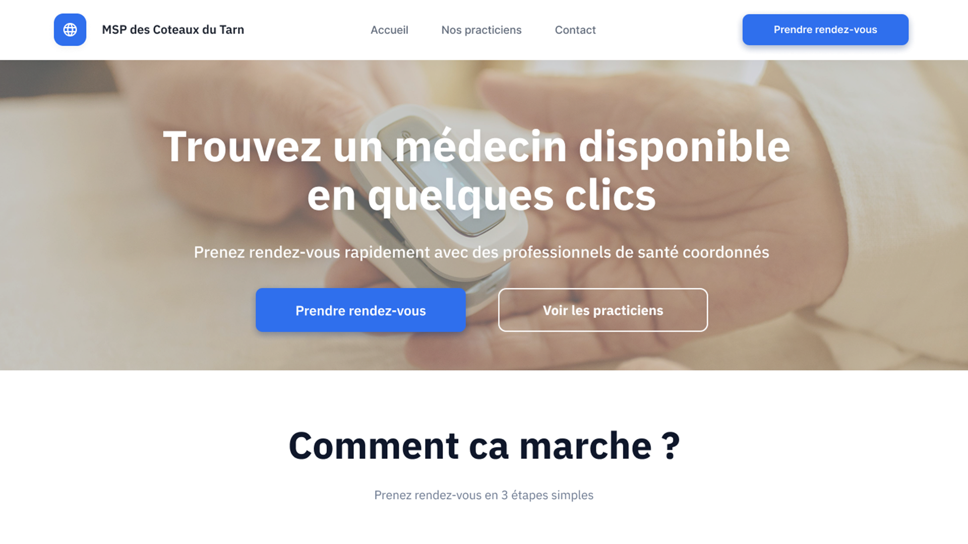
A CTA that stands out
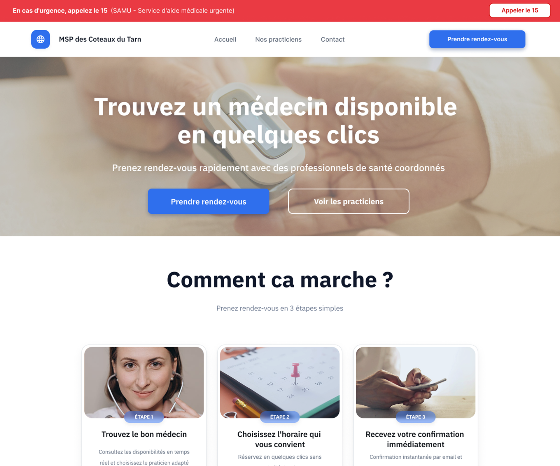
Generic actions were replaced with a clear primary CTA: “Book an appointment”, visible from both the hero section and the navigation.
One clear action, visible immediately.
02
A frictionless journey
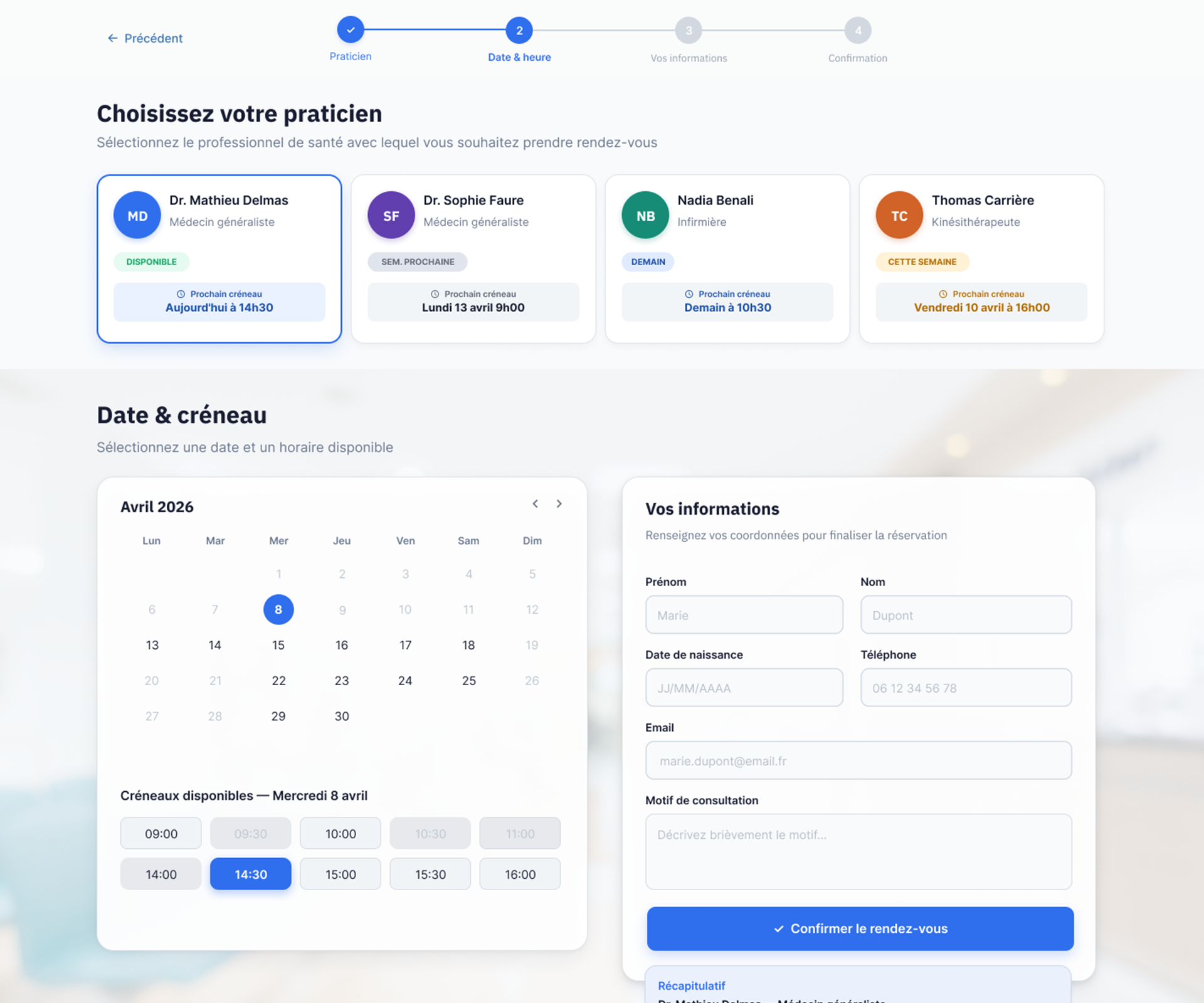
The booking process was reorganised to create a more logical and intuitive progression.
Each step becomes easier to follow.
03
Improved readability
Content was structured through typography, spacing and stronger visual contrast.
Information can be understood at a glance.
Interface evolution
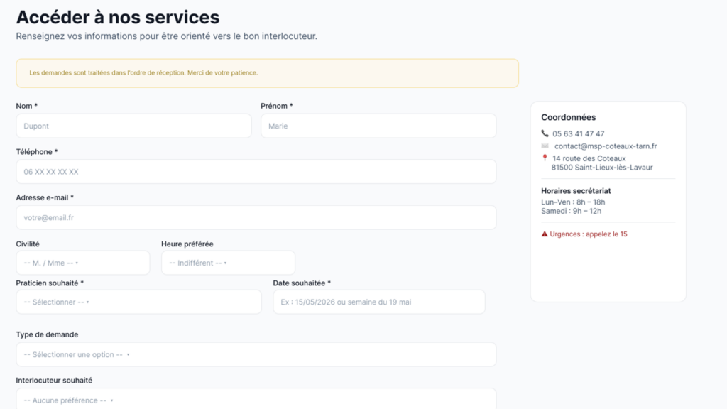
The redesigned journey delivers a smoother and more intuitive experience, making each step easier to understand and navigate.
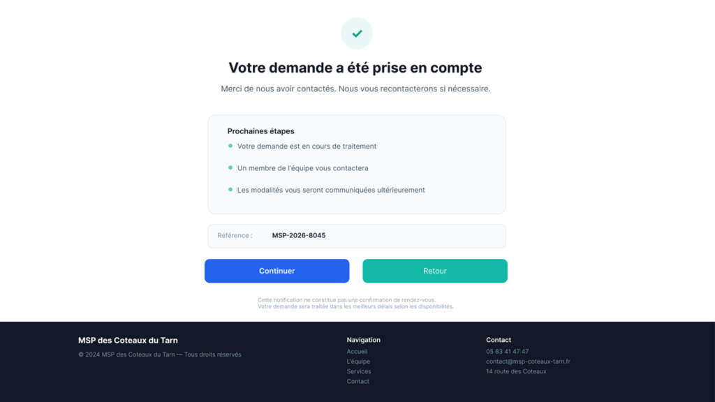
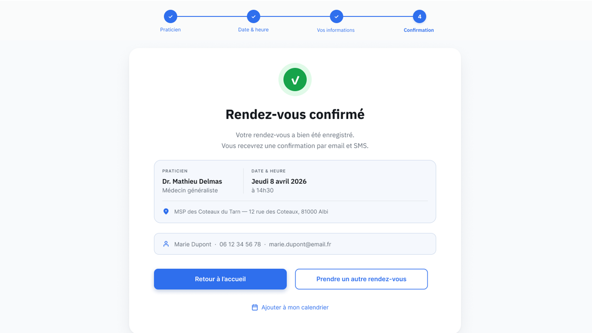
Improved visual hierarchy and clearer feedback help build confidence and create a more engaging experience.
The final prototype is fully interactive and ready to serve as a foundation for product development.
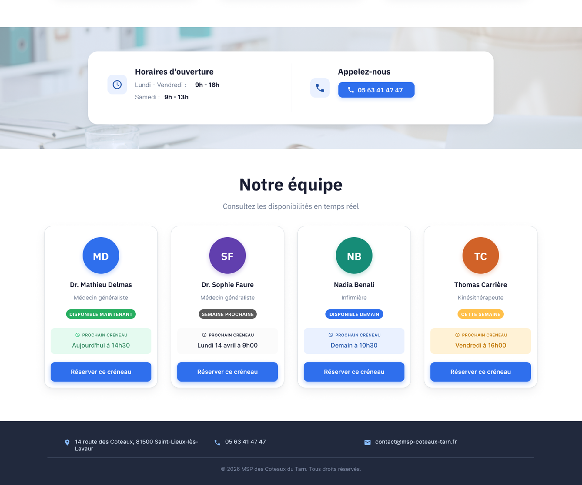
Immediate booking
CTA visible from the first screen.
Availability at a glance
Direct access to appointment slots.
Guided journey
Clear and progressive steps.
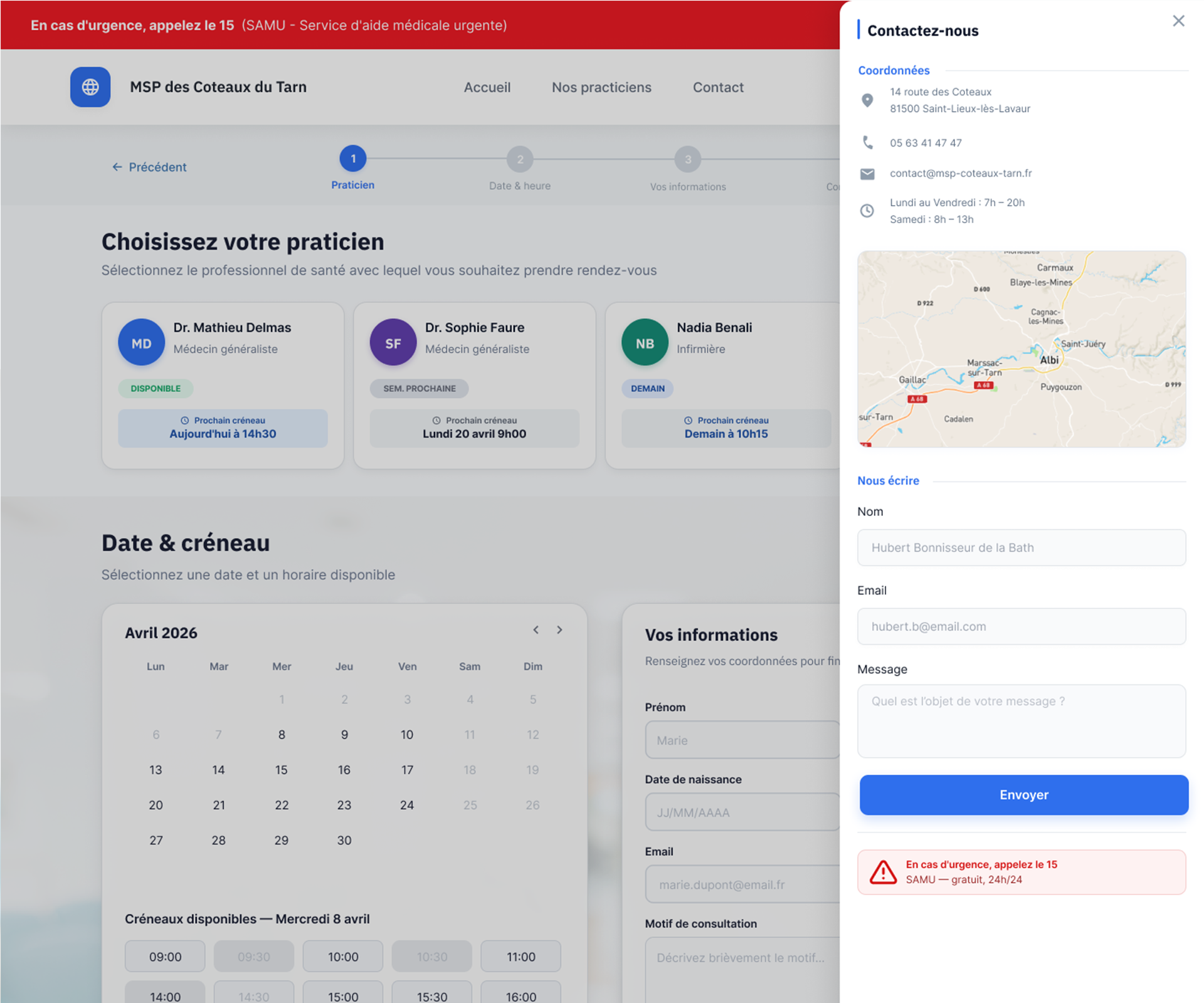
Help when needed
Support remains accessible throughout the process.
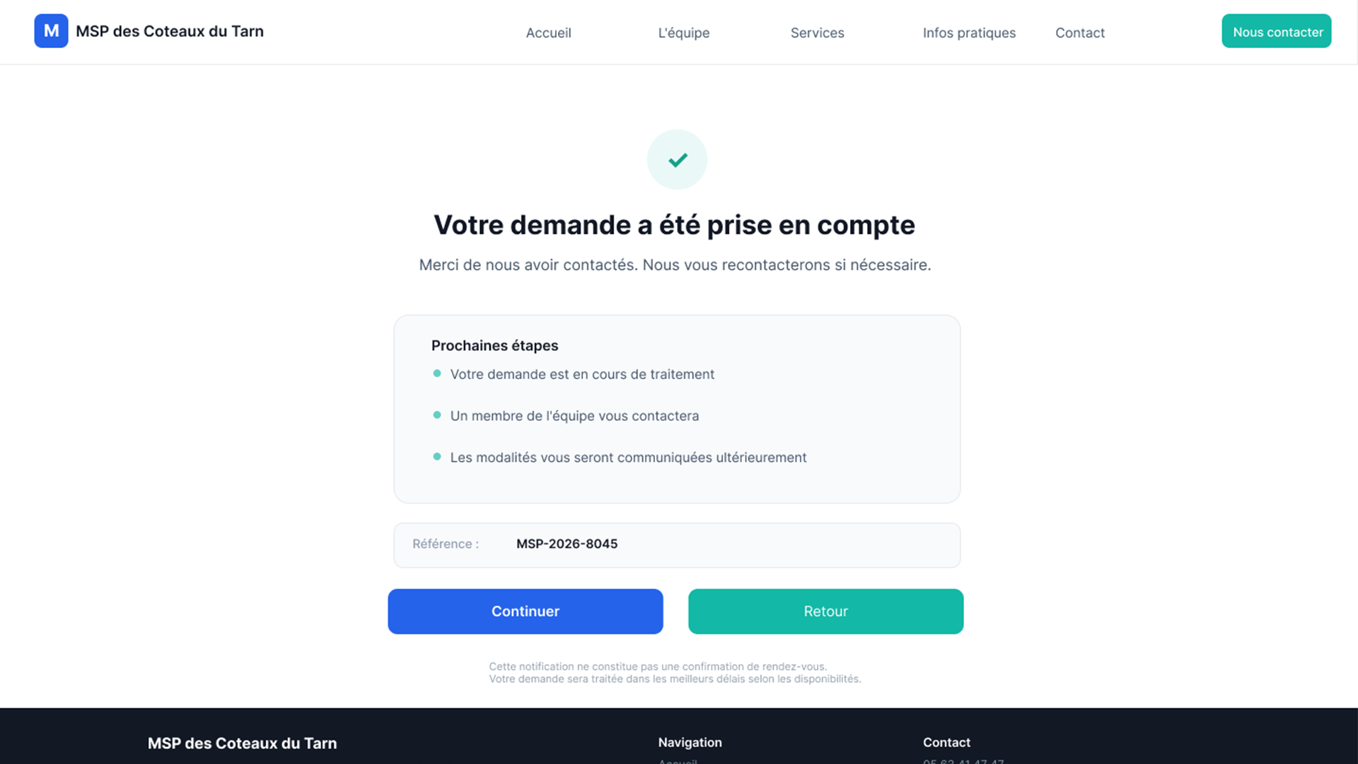
A reassuring end to the booking experience.
Test the prototype
From practitioner selection to appointment confirmation, every step was simplified to guide users through the process with minimal friction.
Explore the interactive prototype and experience the redesigned journey firsthand.
Estimated impact
A user-centred redesign focused on improving key aspects of the experience.
conversion rate
+0%
drop-off rate
-0%
user engagement
+0%
CTA interactions
+0%
Based on UX projections and industry benchmarks.
Users understand what to do, without hesitation.
Have a similar project?
I can help identify friction points and improve the clarity of your user experience.
Un site propre, même en coulisses.
J’utilise des cookies essentiels pour faire fonctionner le site, et d’autres, optionnels, pour comprendre ce qui fonctionne — ou pas.
Rien de caché. Rien d’imposé. Vous gardez la main.
En savoir plus
Les cookies me permettent de faire fonctionner le site et d’améliorer votre expérience. Certains sont indispensables. D’autres m'aident à comprendre comment vous utilisez le site, pour l’améliorer en continu. Vous pouvez choisir ce que vous acceptez à tout moment.
Les cookies nécessaires contribuent à rendre un site Web utilisable en activant des fonctions de base telles que la navigation dans les pages et l\'accès aux zones sécurisées du site Web. Le site Web ne peut pas fonctionner correctement sans ces cookies.
Les cookies marketing sont utilisés pour suivre les visiteurs sur les sites Web. L\'intention est de afficher des publicités pertinentes et engageantes pour l\'utilisateur individuel et ainsi plus précieuses pour les éditeurs et les annonceurs tiers.
Les cookies analytiques aident les propriétaires de sites Web à comprendre comment les visiteurs interagissent avec les sites Web en collectant et en rapportant des informations de manière anonyme.
Les cookies de préférence permettent à un site web de mémoriser des informations qui modifient le comportement ou l\'apparence du site, comme votre langue préférée ou la région dans laquelle vous vous trouvez.